Trees New York Redesign

My task is to revitalize the design of the Trees NY website, a significant resource for individuals keen on planting and nurturing trees in the NYC region. After assessing the website, I identified a crucial problem: while it provided essential information, its design lacked attractiveness and failed to entice users effectively.
Problem
To address this, I made a website prototype with several enhancements to elevate the website's appeal. Primarily, I revamped the color scheme to make it more visually appealing. Additionally, I introduced a new virtual class feature aimed at fostering repeated engagement with the site.
Approach
Emphasize
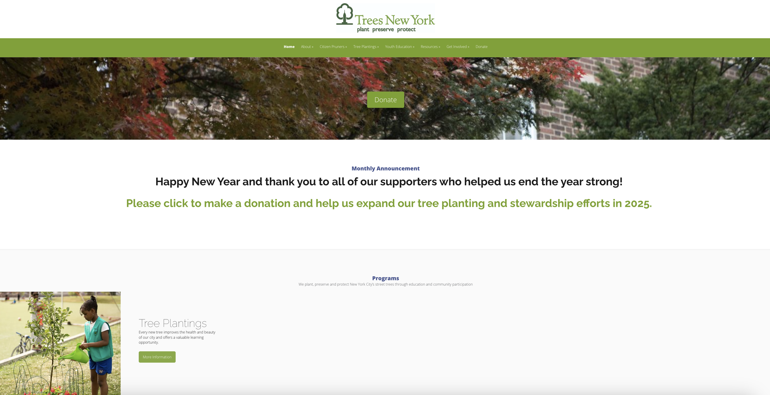
Initial Look of Trees NY Website
The homepage has mismatched margins and excessive white space creating a disjointed experience. It also uses an unflattering green and a photo that doesn’t highlight the benefits of the organization. With a thoughtful refresh, it could better engage users.


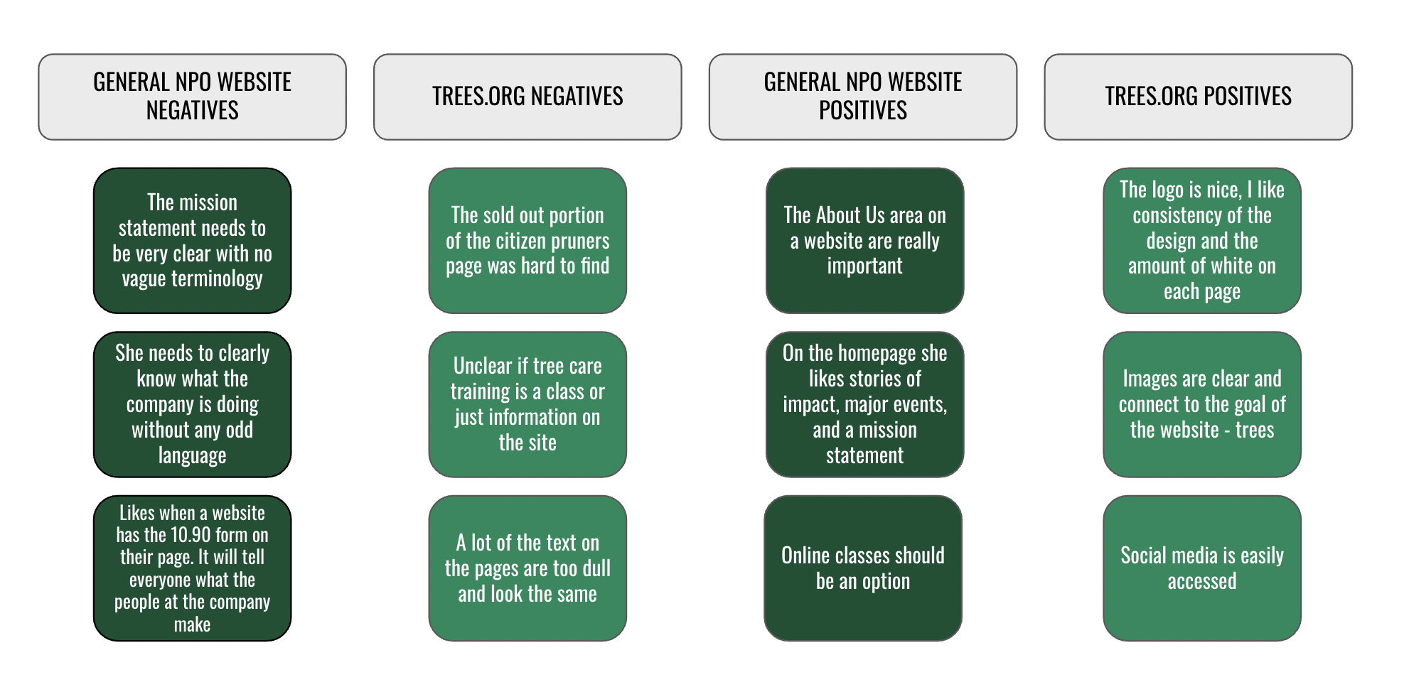
User Interviews & Tests
From my six interviews and test, one thing stood out loud and clear: people loved the consistent design and captivating images throughout the website. So, when I worked on the new pages, I made sure to keep those crowd-pleasing visuals intact.
Following my emphasize process, I resolved to transform the Trees NY website into a well-structured site, enabling users to easily discover available courses, including a new virtual offering designed to facilitate learning about urban forestry. Additionally, my aim is to enhance accessibility for users with hectic schedules and time limitations.
Define & Ideate
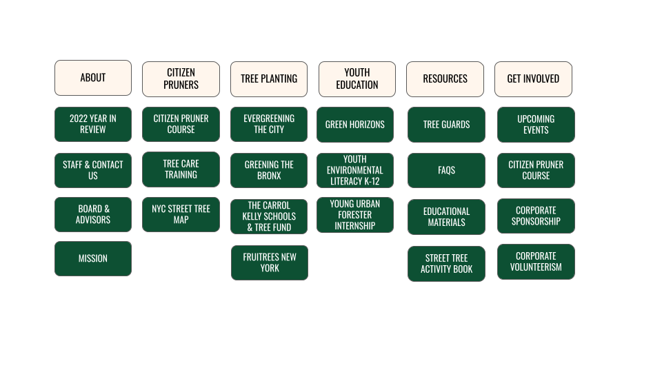
Site Map
Once a key feature was finalized, I decided to revamp the navigation structure.

Before:

After:
User Persona
Following the site map, I created a user persona to better understand the users.

Wirerame & Test
Next, I crafted the low-fidelity wireframes tailored for desktop viewing. Among my adjustments, I made the header bigger in order to showcase a beautiful photo of the city AND nature to better symbolize the organization.
Low-Fidelity Desktop Wireframes


I then conducted testing of our low-fidelity prototype with two users, one of whom works at an NPO. My objective was to pinpoint any design flaws to inform improvements for our high-fidelity prototype. Here are the three primary issues identified during our testing:
Low-Fidelity Usability Testing

I devised straightforward solutions for the identified issues. First, I opted to replace the 'News and Information' label with 'About Us,' aligning with the website's original terminology. Then, to address the final issue, we implemented a notification informing users that they would receive an email containing their receipt and I changed the logo to photos from the original website.
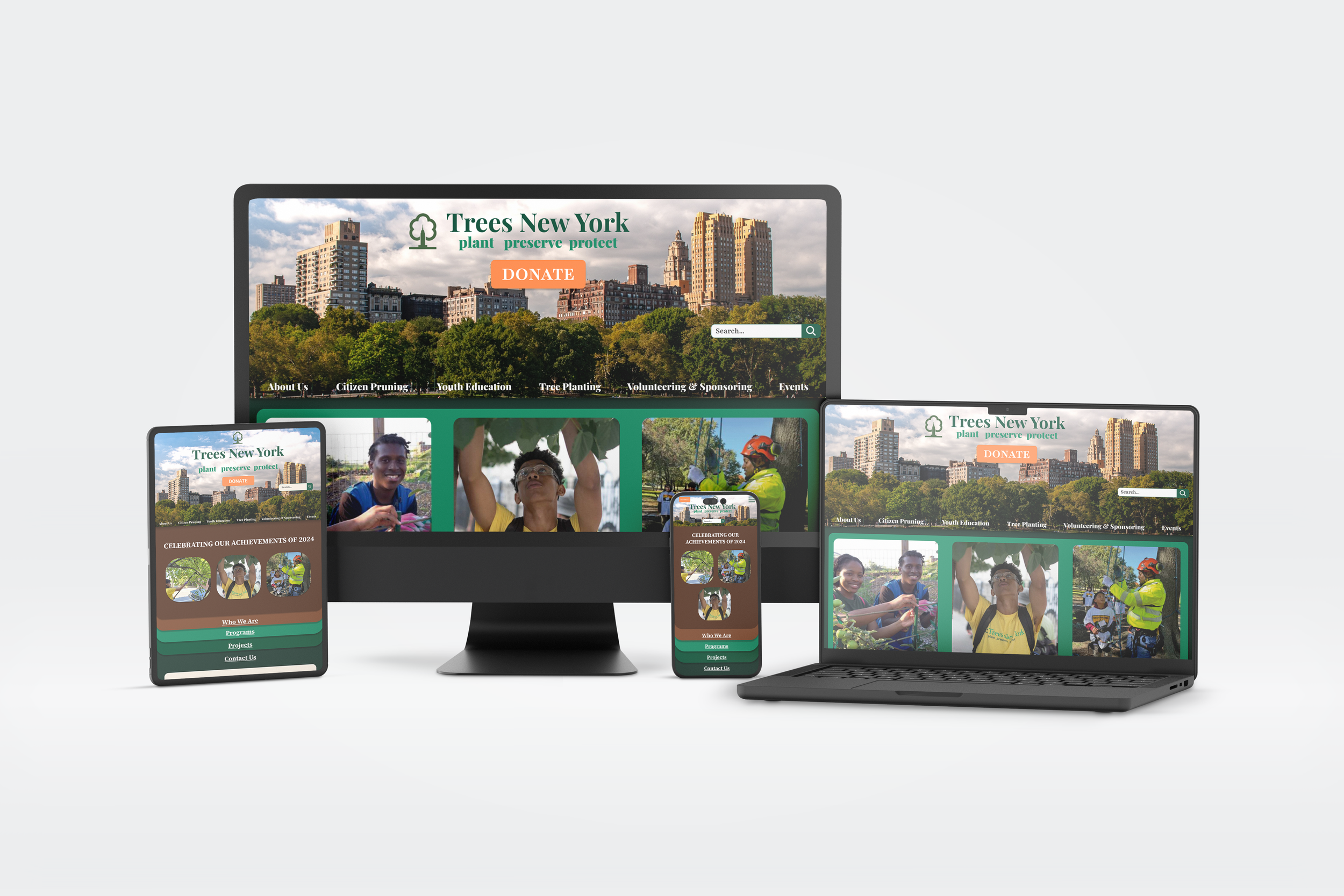
As I crafted our wireframes, I remained mindful of the solutions gleaned from our usability testing. In terms of UI design, I opted for a brighter green as the primary background color. This vibrant green paired with white font exudes a welcoming and engaging aesthetic, ideal for user interaction. On our homepage, I integrated an abundance of photos to convey the joy and fulfillment experienced by volunteers collaborating with the organization. To view the other pages, click the button below.
High-Fidelity Desktop Wireframes
Conclusions & Opportunities
Here are some of the thoughts I had as I finished this project:
Testing is very important and I would continue to test as we improved the website. The critiques I received were integral for getting the website to this stage. Processing critiques are a huge part of UX Design and useful for every design I create.
While I have made initial progress with the new online classes, my goal is to flesh out all the necessary information to enhance its presence on the site and the make it a top function for the Trees NY.
I am are eager to discover any additional facets of the organization that may not be represented on the website and to explore further avenues for enhancing website improvement according to their preferences.
Thanks for reading!

