The Department of Education Redesign

The U.S. Department of Education website serves as a crucial resource for users, offering details on loans, grants, financial aid, and education-related legislation. Unfortunately, the site has remained visually unchanged for an extended period, making it challenging to navigate and read. A modern redesign and improved page organization are urgently needed to enhance user experience.
Problem
I chose to enhance the website's appeal by incorporating brighter, AAA-compliant color variants and updating pages with fresher, more vibrant imagery. Additionally, I improved readability by organizing text into color blocks, making it easier to read, and reducing margins to optimize space for presenting information.
Approach
Emphasize
Initial Look of Department of Education Website
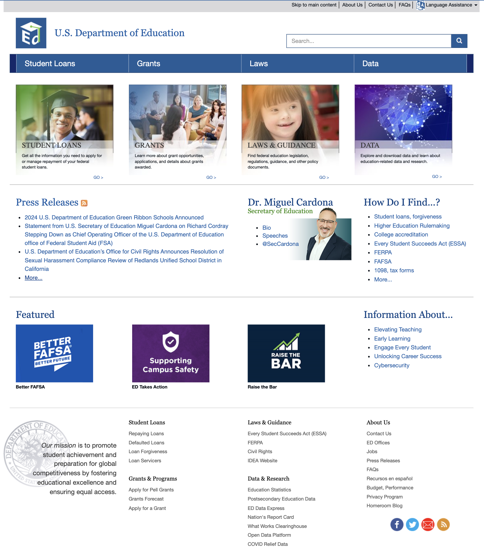
To kickstart my redesign, I examined the existing website. It was apparent that the design hadn't seen updates in quite some time. While the information was up-to-date, the website itself sported outdated photos, drab colors, and difficult navigation. My task was to inject vibrant colors into the palette and devise a more intuitive navigation system to enhance the website's appeal and usability.
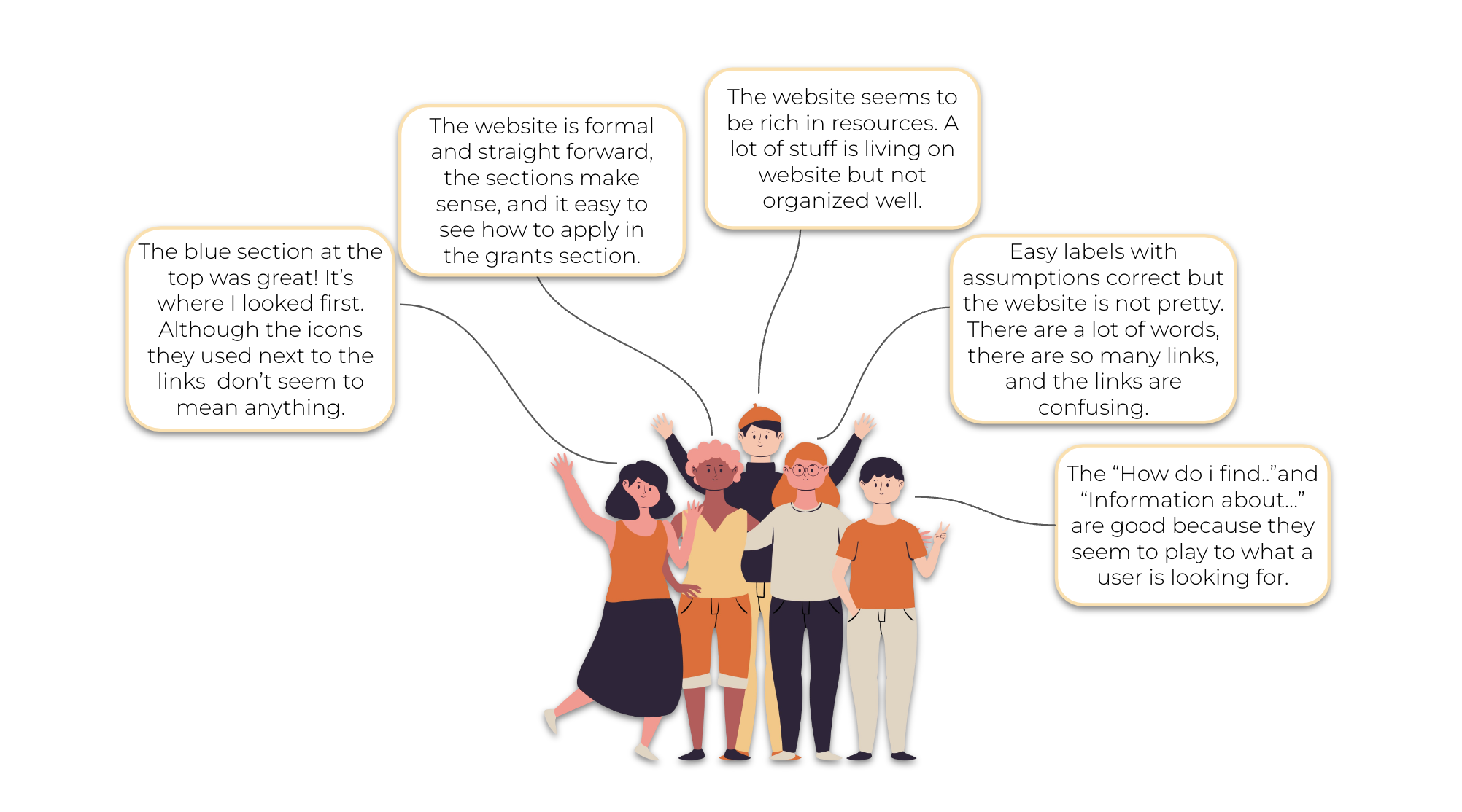
User Tests
Conducting user tests provided valuable insights into the challenges users encountered while attempting various tasks. The feedback from the five participants confirmed my initial observations about the website. They acknowledged the abundance of valuable resources but noted its lack of organization. This process proved instrumental in identifying specific issues with the website and provided a clearer perspective on areas needing improvement.
Define
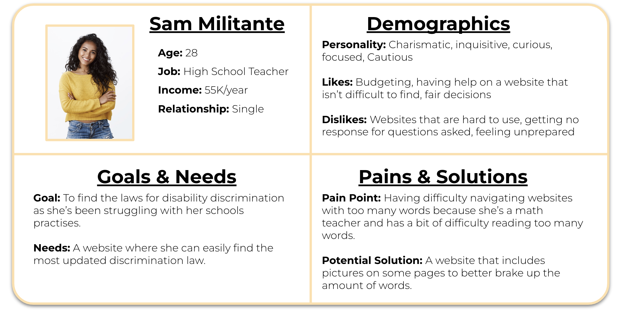
User Persona
To begin my Define phase, I created 2 personas to better understand the users.

Card Sorting

Through card sorting, my aim was to streamline the user's journey to their desired page.
To address this, I enlisted the help of two classmates and myself to conduct the card sorting exercise.
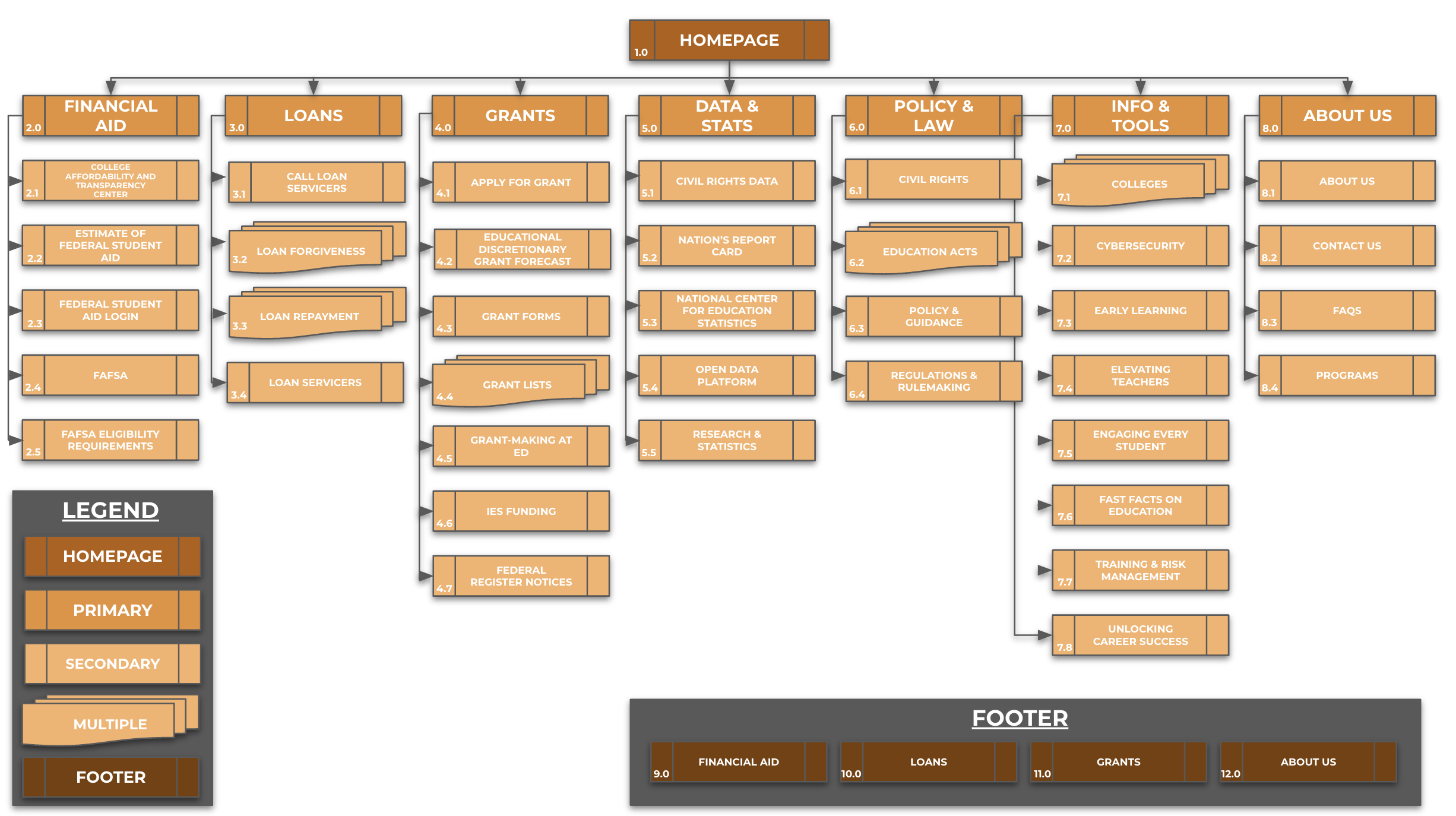
Site Map
With card sorting done, I was able to create a Site Map.
Prototype
Navigation Mid-Fidelity Wireframes
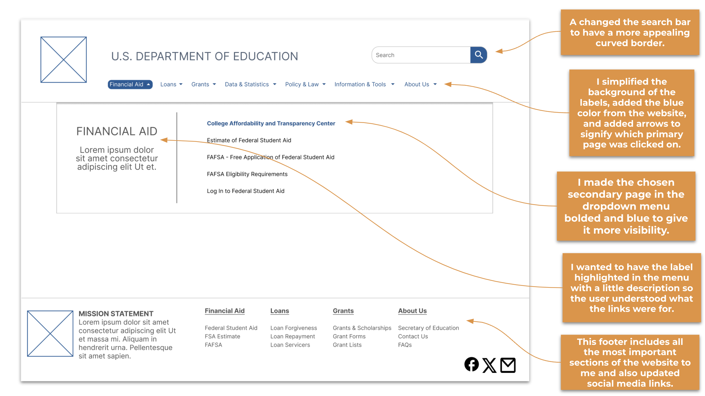
Initially, I created mid-fidelity wireframes focusing on navigation to visualize how it would integrate with the subcategories. Below, you'll notice design decisions aimed at cleaning up and simplifying the page.
PIVOTING
After completing the navigation UI, I deliberated on whether to include the About Us section. Ultimately, I decided to remove it from the main navigation and place it in the footer, which seemed more appropriate. The header should exclusively display pertinent information for all users visiting the page.
The Mid-Fidelity Wireframes introduced a sense of organized simplicity to the website. I revamped the homepage to prioritize showcasing photos, reduced margins to allow for better spacing between sections on each page, and introduced a section for ‘Important Links’ to ensure users could easily access all relevant information. These adjustments were informed by insights gleaned from my user tests.
Final Mid-Fidelity Wireframes
Conclusions & Opportunities
Here are some of the thoughts I had as I finished this project:
I would like to identify any overlooked pages that should have been designated as subcategories. As previously mentioned, the website lacked pre-existing subcategories, so I need to create them from scratch.
Sourcing additional pictures to include on the pages would have been great. The website still feels somewhat cluttered, so I would aim to provide users' eyes with some relief by incorporating more photos.
I wish I had the opportunity to engage with users who have a vested interest in improving the Department of Education's website. Conducting interviews with individuals who are parents or those working within educational institutions could provide valuable insights.
Thanks for reading!
Other Case Studies